You are using an out of date browser. It may not display this or other websites correctly.
You should upgrade or use an alternative browser.
You should upgrade or use an alternative browser.
Ideas for New Forum Logo
- Thread starter Ryan
- Start date
I don't mind it, nobody is going to be totally happy if their model is not represented  . Maybe put a great big honking evo x on it to celebrate the end of a legend and maybe everyone will understand. either way I pity the peeps who have us all throwing our masterful ideas at them and having to make a decision
. Maybe put a great big honking evo x on it to celebrate the end of a legend and maybe everyone will understand. either way I pity the peeps who have us all throwing our masterful ideas at them and having to make a decision Animated Gif and rotate the models include the mirage
I like bucster's idea above, animated gif or slide show showing all lancer / mirage models thru the years ?
I like bucster's idea above, animated gif or slide show showing all lancer / mirage models thru the years ?
Gillzy
Member
True dat, just trying to get all gens repp'dExcept that vast majority of members have a CE coupe
CC sedan then?
Most forums just use headers and footers.
With the image inserted as a logo.png or logo.gif etc, webm is just another format.
Never built any sites using zenforo, its ryans show he'd know for sure. He did mention earlier he didnt want to mod the crap outta the new forum.
With the image inserted as a logo.png or logo.gif etc, webm is just another format.
Never built any sites using zenforo, its ryans show he'd know for sure. He did mention earlier he didnt want to mod the crap outta the new forum.

Not sure if the forum supports webm or not, but I sorta feel that changing/moving graphics is a bit outdated now. Would definitely prefer a more simplistic and minimalist approach.
Likewise I am leaning towards avoiding using colour unless it's fitting in with an Australian theme (ie. Flag or green and gold).
That's just my thoughts at the moment...
I'm quite fond of your Concept 1, except I do want to keep the aspect ratio of the actual text heights the same (so as to differentiate the Aus and Lancsr, plus keep in line with stickers everyone already has).
Concept 2 probably won't work in the sense that I am on my mobile now and the cars are too small to see (which may be an issue for my original ideas too).
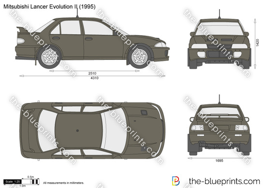
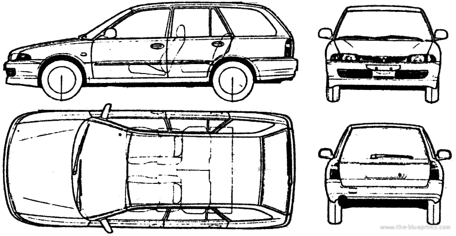
Also I think your idea 2 demonstrates just how similar the CC and CE look and hence why I could never get the silhouette right...
Likewise I am leaning towards avoiding using colour unless it's fitting in with an Australian theme (ie. Flag or green and gold).
That's just my thoughts at the moment...
I'm quite fond of your Concept 1, except I do want to keep the aspect ratio of the actual text heights the same (so as to differentiate the Aus and Lancsr, plus keep in line with stickers everyone already has).
Concept 2 probably won't work in the sense that I am on my mobile now and the cars are too small to see (which may be an issue for my original ideas too).
Also I think your idea 2 demonstrates just how similar the CC and CE look and hence why I could never get the silhouette right...
Yeah personally gif = poxxy.
Concept 2 - Yeah they do look so similar so small and yes I can understand why it wouldnt be great on mobile.
Concept 1 - I will adjust it so it matches the existing text format.
I have another 1 in mind but it will either be so bad or good. Just might take a little longer.
Concept 2 - Yeah they do look so similar so small and yes I can understand why it wouldnt be great on mobile.
Concept 1 - I will adjust it so it matches the existing text format.
I have another 1 in mind but it will either be so bad or good. Just might take a little longer.
narcarsiss
New Member
As a Web designer / Designer I hopefully hold some merit on this here topic.
Logo should be able to be compressed into an icon. (for mobile)
logo should look good in black and white.
logo if used for branding, needs to be small in size.
logo needs to be identified from a distance without any working.
logo should not loose style over years (say 5? is it still cool)
Does it look good on a black/dark grey background?
Does it look good on a light/bright background?
Does it look good on a multicolour background?
DO NOT use stock images or clipart (build in brushes in photoshop or google images) a logo must be unique.
USE geometric shapes, a long logo (my really really long brand .com) is not a logo.
Create your logo in Vector format, this allows it to be used for other things like scaling a billboard, or shrinking to a mobile without it looking squished, loosing detail or becoming un readable.
dont confuse LOGO with Branding. Not sure? look it up your on the internet.
LOGO's are Like quotes. It takes time to make a good one.
do not style the logo,
do not put text on the logo
do not put the logo in a box.
do not put the logo in a frame.
I do not like green eggs and ham
Do not add stroke (outline) to a logo
do not add shades to a logo. (look at other top brands for example.
Use LOGO Thief website to check how close your logo is to others.
and Finally SKETCH EVERYTHING!You will be surprised at something you hate is actually pretty cool to everyone else.
Good luck and sorry for the (i seem to hate everyone) post.
The above is common sense really and I would love to approach it in the above fasion and make everything for scratch, but to be honest I cannot invest time into it. Honestly, I would actually say that we try use fiverr to get one made. Cheap as chips.